DroneDeploy Mobile Walkthrough App
The DroneDeploy Mobile Walkthrough App was designed from the ground up to enable users to capture high quality 360 videos, panoramas or detailed mobile photos and add them to their DroneDeploy project.
My Role
I was the sole Designer working with the Project Manager for the full duration of this project. I conducted all research and user that data to create our roadmap for our first ever ground capture mobile app. Once the roadmap was approved by leadership I put together a detailed design plan. i worked closely with engineers to understand the most efficient way to roll it out and provided 100% of the designs.
The Problem
Our customers were able to capture their site using arial drones but that only took care of half of the problem. How would users inspect and document the interior of their site and integrate it into the DroneDeploy system?

The Research
Research revealed an overall understanding of the problems that our users were seeking to solve. However we also received specific feature requests as well.
Research and Planning
Going through previous research on a variety of topics revealed some serious gaps that our customers were facing. In many cases they used DroneDeploy for site planning, exterior documentation / inspections and a different tool to capture the interior of their project. Those other tools were StructionSite and Openspace, our direct competitors in the space. I created accounts with each one and mapped out every workflow and feature available to me.
At this stage I felt I knew enough to interview our internal SME’s like support staff, account executives, sales and other product team members. During this process I also got information on which customers might be able to give me more details.
Finally, I held interviews with a select group of customers that were using some of those competing products or just handling things the old fashioned way
The Roll Out
We knew what the final product needed to offer but we needed to roll it out feature by feature to get our customers going.
Design/Release Plan
Synthesis of the research gave us a clear direction as well as priority of features to work on over the next year:
360° video walkthrough
Detailed mobile photo capture
Detailed 360° panorama
Capture Gallery
Issue view and creation
Upload management
Our customers were eager to get their hands on the app and start using the 360° video walkthrough in their projects ASAP. That meant looking at the final product and walking it backwards feature by feature.
I worked with the engineering teams to build out a release plan based on priority and engineering recommendations. Then the PM and I created usage goals based on these phases and again presented them to Leadership.
With everyone in agreeance, I began to design workflows for each of the 5 phases, starting at the final product and working backwards.

Time for some fun
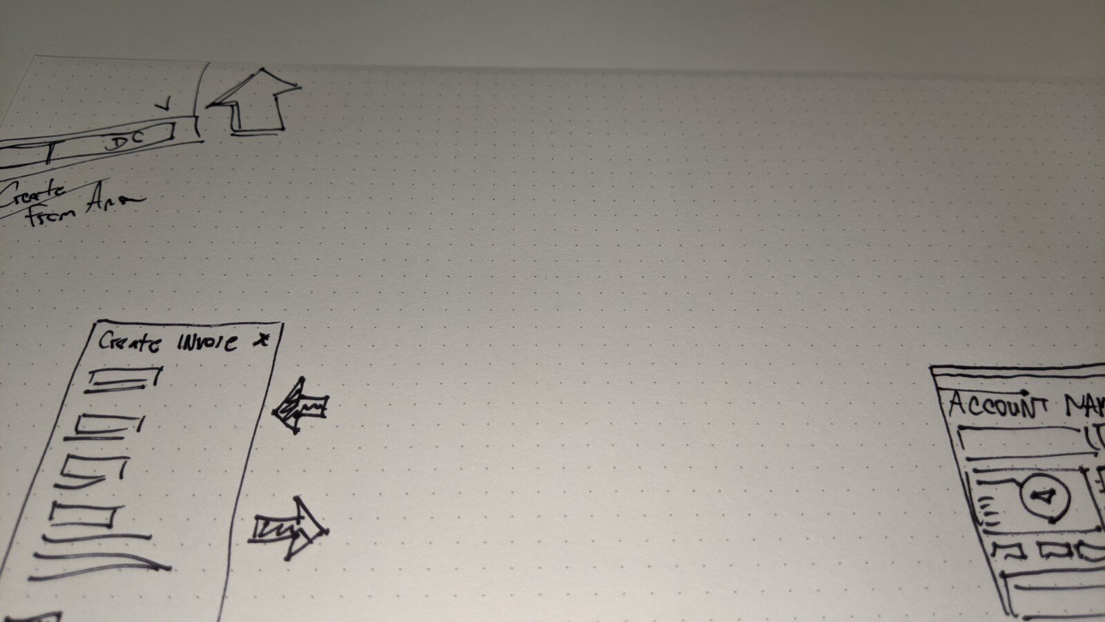
At this point it’s time to start sketching out some concepts!
Initial Wireframes
I attacked this from all different directions while “sketching”. I started with a few hand drawn wires and then quickly jumped in to Figma when i felt i had some solid directions.
We wanted the workflows to be as quick and easy as possible to encourage usage in the field. Users needed to quickly capture data on site throughout their day and not get bogged down so navigation style was a key focus.
I went back to our SME’s and got some solid feedback that put one of the concepts ahead of the rest.

Concept 1 - Hamburger Menu
My first concept used the common hamburger menu to navigate within a project. This concept made it easy to grow the app over time due the nature of the menu that slides out.
Concept 2 - Tab Menu
The next concept utilized a bottom navigation bar which was very similar to our competitors. This concept was great for visibility simple workflows but was limited in how much it could be expanded. However, while working out the phases that it would go through I began experimenting with a concept that didn’t have a standard navigation similar to early Instagram or snap chat.
Concept 3 - No Menu
The last concept that we considered was the most challenging but also showed the most promise. The goal was to remove navigation items that held up the workflow and allow for more contextual navigation.
Final Designs
I still had a few minor questions but felt very comfortable in converting the wires into high fidelity prototypes.
Final Designs
We performed usability testing live and virtually which landed us on the option with no menu and more contextual workflows. I took visual queues from our current branding and website but made a few updates to iconography and opted for dark mode.
We tested the prototype internally with our experts, in the field with real customers, and using a third party testing tool called maze. To test the usability of the designs we gave users several tasks to complete and measured their success based on completion of the tasks. Overall, 88% of users completed all assigned tasks which told us we were ready to move forward.
Photo flow:
360 Walkthrough flow:
360 Panorama flow:
Location tray:
Camera access flow:
Notifications:
Permissions:
Onboarding:
What I learned
This project was a great experience. I really thrive in projects where I’m able to look at the bigger picture and strategize on the future of the product..
Data is King
Getting buy-in from leadership can be tough at times but in this case we had great data to work with. It isn't always typical for our projects to have data to support the current state of the problem. This data made it a lot easier for the team to make decisions and to be able to measure the success once implemented.
User Adoption
The PM and I were tasked with meeting user adoption quotas quarter after quarter.
Q1
Goal: 200 users
Recorded: 219 users
Q2
Goal: 1,000 users
Recorded: 1,240 users
Q3
Goal: 3,000 users
Recorded: 4,402 users
Q4
Goal: 8,000 users
Recorded: 9,049 users