User Onboarding Experience
Rackspace needed educate new customers on the intricacies of the UI as well as common tasks available. Additionally, there was a need to introduce new products and features to current customers.
My Role
As the Lead UX/UI designer, I identified the problem and brought it to the attention of the Product Manager. From that point on, I lead the entire project all the way to delivering final designs. To do this, I worked with multiple product teams and engineers to form a cross-functional strategy.
The Problem
When new customers sign up for a product/service they’re dumped in the portal without any information as to what they can or should do next. This leads to a lack of activations and an increased drop off rate. To improve user engagement and drive retention, we needed to introduce users to the basics of the portal and educate them on the capabilities of the product.
Design Thinking
The development process of was shaped by the principles of the design thinking methodology. It helped me to keep a solution and action-focused mindset within every design phase.
Competitive Analysis
I hadn’t ever worked on a project like this so i was interested to see what our competitors were doing.
Graphical Tours
Short phrases accompanied by simple graphics outlining the value of the app and basics to get around
Coach Marks, Tooltips and Guidestones
Used to draw attention to areas of interaction that are especially helpful in more complex interfaces
Guided Tasks
A method for prompting users to interact with the product in a series of steps
Progressive Onboarding
Prompts a user to indicate their level of expertise or aptitude. Helps a user set proper expectations
The Audience
User types made more sense to use in this scenario instead of personas because they aren't a demographic and don't personify a group into a single character. The basis of user types is a set of behaviours that users are mapped against.
The goal
User stories helped me to understand how to align business goals (new functions) with user needs.
I worked with product managers who know their products and customers to discuss common tasks and goals of their users. We then interviewed support staff and launch teams to outline what critical information users really needed to get started.
From there I wrote the user stories and ran them by the PM’s one last time so I could move forward with user flows.
Ideating Solutions
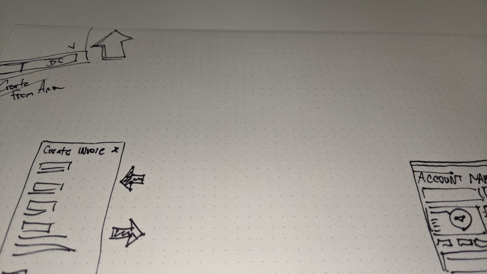
After defining the user flow, it was time to pull out the pencil and sketch pad. I sketched quickly to keep momentum and ideas coming for both mobile and desktop.
It took a few concepts and revisions until I created a structure that was clear, concise and easy to use. I always reached out for feedback and tested the design with my peers throughout the entire process.
Best Solution for our users
Based on the user stories, goals and structure of the site we found a couple options would work best to deliver the information.
A conversational tone that does not use jargon specific to the product.
Multi-purpose usage! Walk users through a specific workflow, call out the important parts of the UI or highlight new features.
Subtle and easy to exit so it doesn’t distract from the actual experience of using the product or interrupt the user.
Short and simple while giving users the option to learn more if they want..
The Mobile App
Users accessing the app will have already been onboarded once via the desktop portal.
However, due to limited functionality within the app they may be slightly disoriented.
What mobile users needed was to be educated on the nuances of the navigation and not be bogged down with information that was already covered in the desktop version.
Customer Interviews
After the Design Sprint we conducted interviews with users to get feedback on our design. Each user validated our concept and was able to provide even more insight and things to consider in future iterations.
User Feedback
"This is massive improvement"
"Where was this when i signed up?"
"This is way more intuitive than what is happening now"
The Final Product
Within only 30 days of implementing the new onboarding tour, the drop-off rate decreased from 19% to 11% resulting millions in MRR.